Product Designer


trubel&co
Improving an ed-tech nonprofit's current website design.

The Client
trubel&co is an ed-tech non-profit dedicated to empowering high school students from underrepresented backgrounds with STEM skills to advocate for environmental issues in their communities.
Through their Mapping Justice program, trubel&co teaches students geospatial skills as they work on independent climate-related projects about the Gulf Coast and Hawaii.
Project Objective
In this project, we aimed to improve trubel&co’s website for better navigation and accessibility, making it easier for students to find information and for donors to be encouraged to contribute.
In our final product, we...
1) reduced redundant information by tightening and streamlining the information architecture
2) created a more accessible design system and
3) fully redesigned the website’s three main pages: the Home, Impact, and Mapping Justice pages.
Duration
4 months
Context
Professional, Group Project
Skills
UI DESIGN
PRODUCT DESIGN
RAPID PROTOTYPING
Tools

Team
Product Design Manager: Danielle Sarkisian (Me!)
Product Manager: Esther Kim
Designers: Roshni Paleja, Jazmin Vega Rodriguez, Priya Venkatesan, Justin Park, Neath Heng

Planning
Timeline
Weeks 1-3
Team and client intros, initial user survey
Weeks 4-5
Create product requirement document and project plan timeline
Weeks 5-6
Create design system and redo information architecture
Weeks 7-8
Initial low-fidelity wireframes and usability testing
Weeks 9-12
High-fidelity design in Figma and multiple iterations
Weeks 12-14
Squarespace implementation and iterations
Weeks 15-16
Project Demo and client handoff
Client Goals
Increase audience engagement, which means...
reaching students for their programs
1
gaining support from new donors & organization partners
2
Discover
Our Initial Observations
-
busy visual design that did not seem to meet accessibility standards
-
too much information and offerings confusing
-
too many pages and difficulty finding info
-
lack of clear call to actions
-
embedded Mapping Justice page was difficult to use

Initial User Survey
Using Qualtrics, we conducted an initial survey to evaluate users' experiences with trubel&co's original website. This helped us identify key pain points and understand target user groups' thought processes while navigating the site. For participants unfamiliar with trubel&co, we provided the following user role prompts to simulate real interactions:
1
Prospective Students
Goal: locate student application info, details of the Mapping Justice curriculum, and alumni impact.
2
Workshop Customers

Goal: find workshop info and discover how to request one.
3
Potential Supporters

Goal: discover org's
mission, impact, and how to donate or support.
Based on our study results, we found the following:
🔍
Navigation Issues
Users across all groups struggled to find information on workshops, applications, and donations, indicating potential problems with website navigation, information architecture, or unclear calls to action. The "apply" button/link was a particular pain point.
🤯
Information Overload
Reported too much text, difficulty skimming, and issues with color pairings affecting readability.

Unclear Pricing & Donation Info
Unclear pricing information for workshops and a desire for more transparency regarding how donations are used.
Confusion About Programs
Confusion about the Mapping Justice program, its locations, and how to find example projects. While some found the information, others struggled.
👍
Liked Mission & Org Voice
Respondents appreciated the organization's mission, the website"voice", and student quotes.
💤
Survey Fatigue
One respondent explicitly mentioned survey fatigue, highlighting the importance of keeping surveys concise and focused.
Define
Product Requirements
Based on our research insights and client's goals, we defined key product requirements and prioritized them from highest (left) to lowest (right). Our focus was to enhance accessibility, navigation, and overall user experience while ensuring that trubel&co's mission and impact are effectively communicated.
Information Architecture + Design System
Total Group

Home Page
Roshni & Jazmin

Impact Page
Priya & Justin

Mapping Justice Page
Danielle (Me) & Neath

Information Architecture
Once we prioritized our project scope, we began brainstorming a new way of organizing for the information architecture.
Before

After

Given our observations and research insights, we wanted to reduce the number of items in the navigation bar, delete unnecessary pages, and make the information on each page concise. Between the "Before" and "After" site maps, we made the following changes:
-
Changed "Work" to "Programs" for clarity
-
Got rid of unnecessary and confusing pages: Learn, Build, Connect, and "Data for Civic Action
-
Removed "Home" from navigation bar and maintained home access through the logo
Design System
Our team developed a design system to improve accessibility and consistency by standardizing typography, colors, and UI components, ensuring a cohesive and user-friendly experience. We added a secondary complementary font and focused on a primary color with various accents.
Typography
Color Guide
Buttons

Quotes

Design
Low-Fidelity Overview
In the low-fidelity stage, we focused on defining the core structure, user flow, and information hierarchy for the Home, Impact, and Mapping Justice pages. These early wireframes allowed us to test layouts and navigation before committing to visual details.

Mapping Justice Wireframes
While I contributed to the overall site’s design strategy, the design section of this case study will take a deeper dive into my work on the Mapping Justice page, showcasing my design process from initial wireframes to final iterations.
In the low-fidelity wireframes, we replaced the embedded page and prioritized clear call-to-actions, immediate program understanding, and streamlined access to past projects. We retained user-favored quotes from the initial survey and, after noticing recurring confusion, I suggested adding an FAQ section for clarity.

CTA buttons
student quotes
program info
FAQs
past project archives
featured projects

High Fidelity Overview
In the high-fidelity phase, we refined the visual design, layout, and interactions through three iterations, ensuring a polished and user-friendly experience. This phase incorporated not only user feedback but also insights from stakeholders to guide our decisions for each page.

Mapping Justice Iterations
1st Iteration
For the Mapping Justice page, the first iteration focused on translating the wireframe structure into a more detailed design. Key design elements, such as typography, imagery, and call-to-action buttons, were selected to enhance clarity, user engagement, and meet stakeholder expectations.


Key Focus Areas:
-
Layout: Developed the foundational layout for the Mapping Justice page
-
Navigation: Focused on clarity in how users would move through the content.
-
Call-to-Actions (CTAs): Placed initial CTAs to drive user action.
-
Microcopy: Initial text choices to introduce the program and explain its purpose.
-
Visual Design: Chose visual style elements like color and typography.
Stakeholder Feedback (for next iteration):
-
disliked circle photos
-
wanted to change order of blocks by moving up quotes and moving down featured projects
-
Design team decided to standardize quote design across pages (as seen in design system)
-
Liked the different colors for each block
2nd Iteration
The second iteration focused on making changes based on our design team discussion and client feedback.


Key Focus Areas:
-
Blocks: moved up quotes block and moved down featured projects.
-
Standardization: standardized design across pages with hero image frame and quotes.
-
Call-to-Actions (CTAs): Placed initial CTAs to drive user action.
-
Images: changed image shape to squares
-
Color Division: maintained different color blocks.
Stakeholder Feedback (for next iteration):
-
liked the design progress so far
-
willing to listen to user insights
-
Add division for FAQs and Apply CTAs
-
Create two application buttons for different locations
-
Design team decided to standardize all-caps for page titles
-
no photos for quote sources
Usability Testing
We conducted a quick usability test for the Home Page, as it was our highest priority. One of the insights we gained translated to our other redesign pages as well, including the Mapping Justice page.
📝
Microcopy Ineffective & Organization
Participants emphasized the need for simpler language and clearer content presentation to improve user engagement.
From this insight, I suggested changing the design of the "Why Mapping Justice" block to something more visibly digestible with broken up text and icons, which the client was on board with.

Block View

List View

client preference
Deliver
Final Iteration
The final Mapping Justice iteration focused on making final edits based on client feedback before implementation.


Key Focus Areas:
-
Why Mapping Justice Block: inputed list and icon view of this section.
-
Hero Block: separate CTAs for each location and standardize title font/all-caps.
-
CTA Block Division: used color background to create division between FAQs and application CTA.
-
Finalize Copy: client provided finalized copy for quotes, FAQs, and featured projects.
Stakeholder Feedback:
-
Ready for implementation!
Final Designs (Other Pages)
Although I did not design the Home and Impact pages, I led the design process, provided strategic direction, and offered feedback to ensure consistency and alignment with user needs. Here are the final high-fidelity designs:
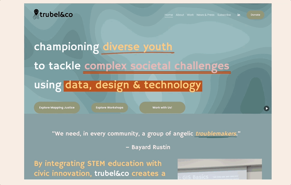
Home Page

Impact Page
.png)
Impact
Post-Project Research Results
After completing the design implementation, we conducted a post-redesign survey and compared it to our initial survey results. We found the following:
20% increase
🔍
in the ratings for “ease of finding key information”
8% increase
✅
in overall likelihood for users to complete key
actions (apply, donate)
2.25 mins faster
⏱️
on average to find key information after the redesign
Client Testimonial
It has been really enjoyable to work alongside such a willing team -- everyone we've worked with has had a great attitude and has been really easy to work with. They've been receptive to feedback, have brought their insights and ideas to the table, and have drastically improved our website's usability and appearance."
- Annie Grant, Associate Director @ trubel&co
Reflection
This project was an incredible opportunity to lead the design process alongside a product manager, refining my collaboration and decision-making skills. I learned how to balance client expectations with user needs by working closely with a key stakeholder, ensuring our designs were both strategic and user-centered. Seeing our work come to life on a live website was especially rewarding. Most importantly, using design to support a nonprofit and contribute to tech for social good made the experience even more fulfilling.
Key Takeaways
-
Strengthened my leadership skills by guiding the design process.
-
Learned the importance of balancing client and user needs in real-world projects.
-
Found implementation to be an exciting and rewarding part of the design journey.
-
Reinforced my passion for using design to support nonprofits and create social impact.